LISN
Improving LISN’s onboarding flow and home page to simplify podcast discovery and enhance user engagement through intuitive design.


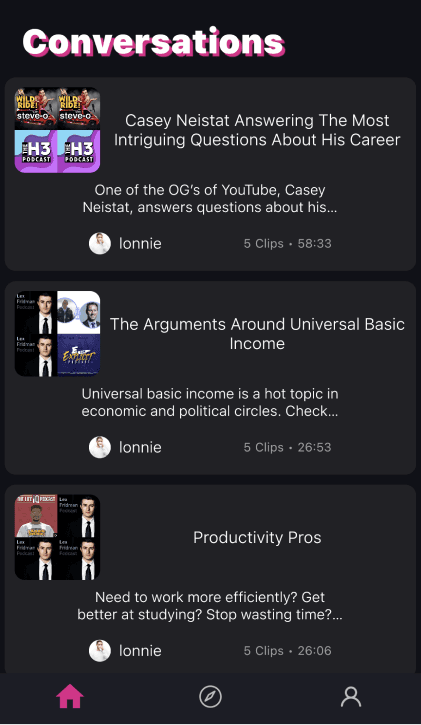
A lack of onboarding guidance for core features like “Conversations” and “Clips.”
Disorganized content scattered across multiple menus.
Difficulty accessing frequently used features.
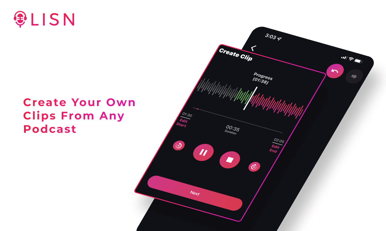
I designed a new onboarding flow that introduces users to LISN’s core features through interactive, easy-to-follow animations, ensuring a seamless start to our app's experience
Disorganized Content
Users had to navigate to their profile page to find their shows and clips

Old Profile Page
Unclear Home Page
The page only displayed “Conversations” without showing users their current shows, listening progress, or recommendations.
Misaligned text, uneven spacing, and repetitive layouts created a cluttered and unpolished experience.
Old Home Page
The redesigned home page organizes content intuitively, making it easier for users to find their favorite features and discover new podcasts with ease.

Before and after home page redesign
New Home Page
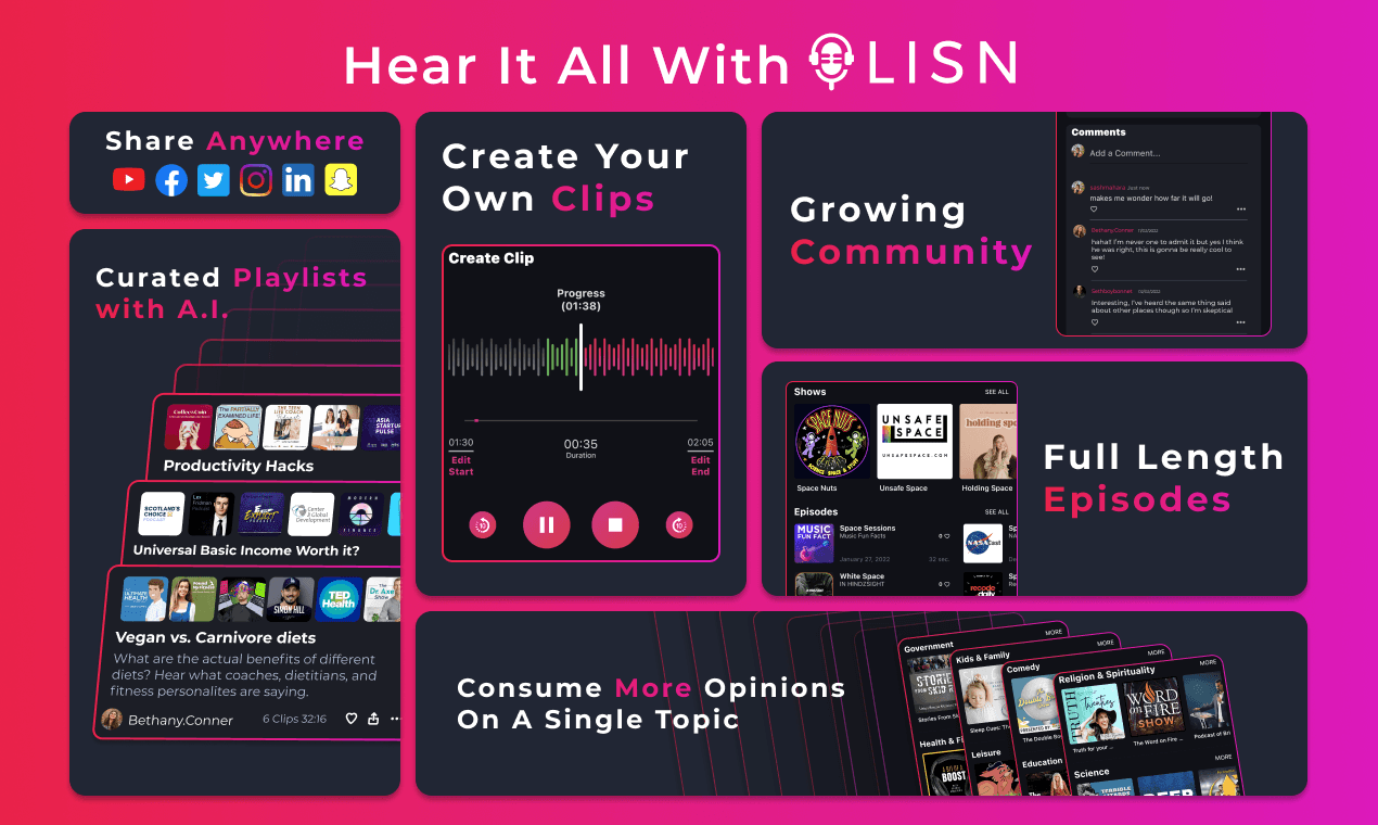
Search functionality right from home
Users can easily continue where they left off with multiple podcasts
New episodes of followed podcasts brought to the home page
Quick Filters for better organization
Conversations showcase podcast art in carousel and feature additional info with interactions
1
Research & Insights
2
Onboarding Redesign
3
Home Page Redesign
4
User Testing & Iterations
5
Final Design
Explore the Complete Case Study
Explore the full case study to dive deeper into the complete design process, including research insights, concept development, wireframes, competitive analysis, and UI creation.